

Teryce is a hard working student who is always focused on her work! I appreciate her kindness and relatability.

Teryce is a wonderful and kind classmate with some amazing portfolio work! She will definitely go far, and I'm glad that she's in our class with us.

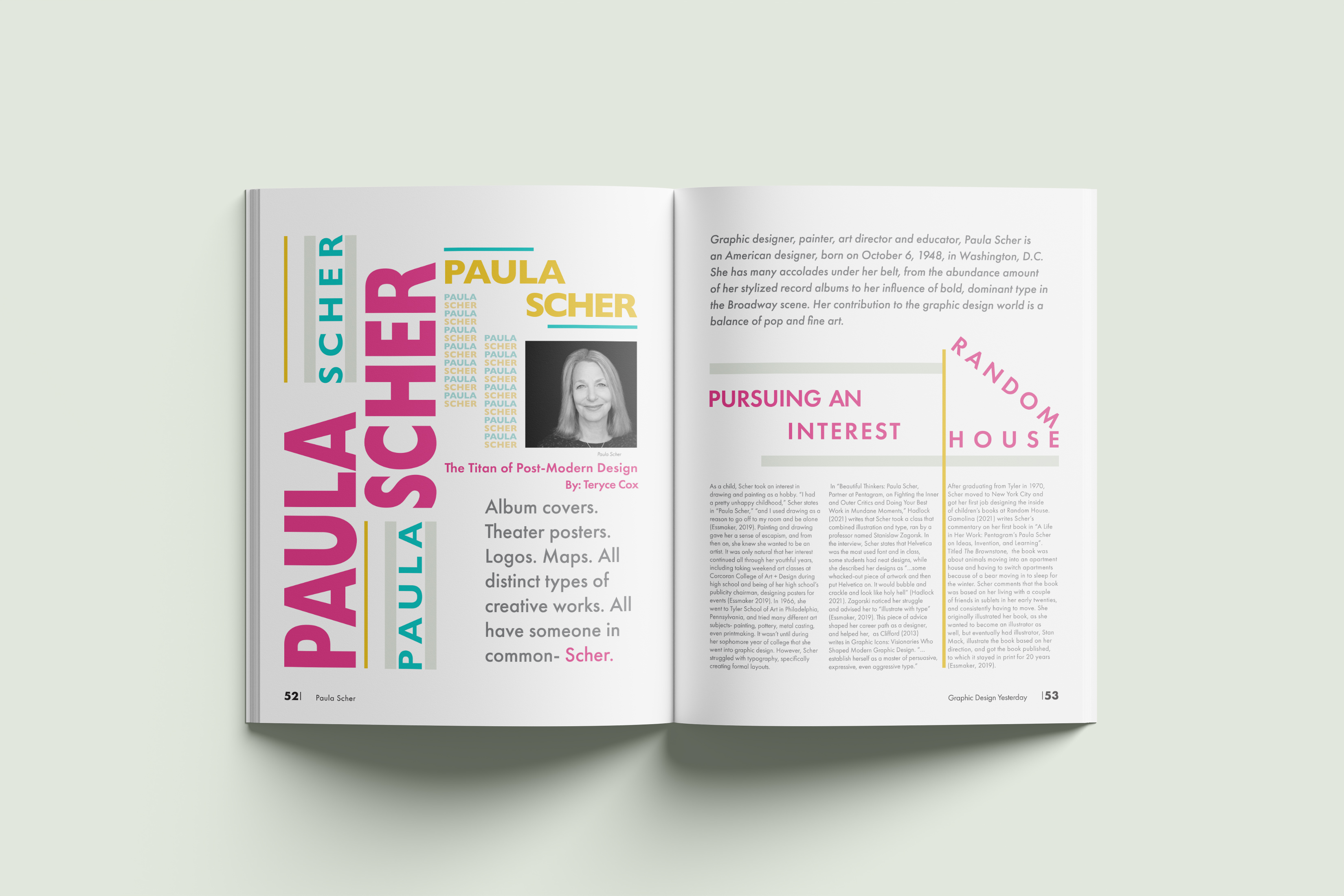
A 4-spread magazine layout on major graphic designer Paula Scher. The layout focuses on expressive arrangement of type and bold, vibrant colors as interpretation of Scher’s own design work.
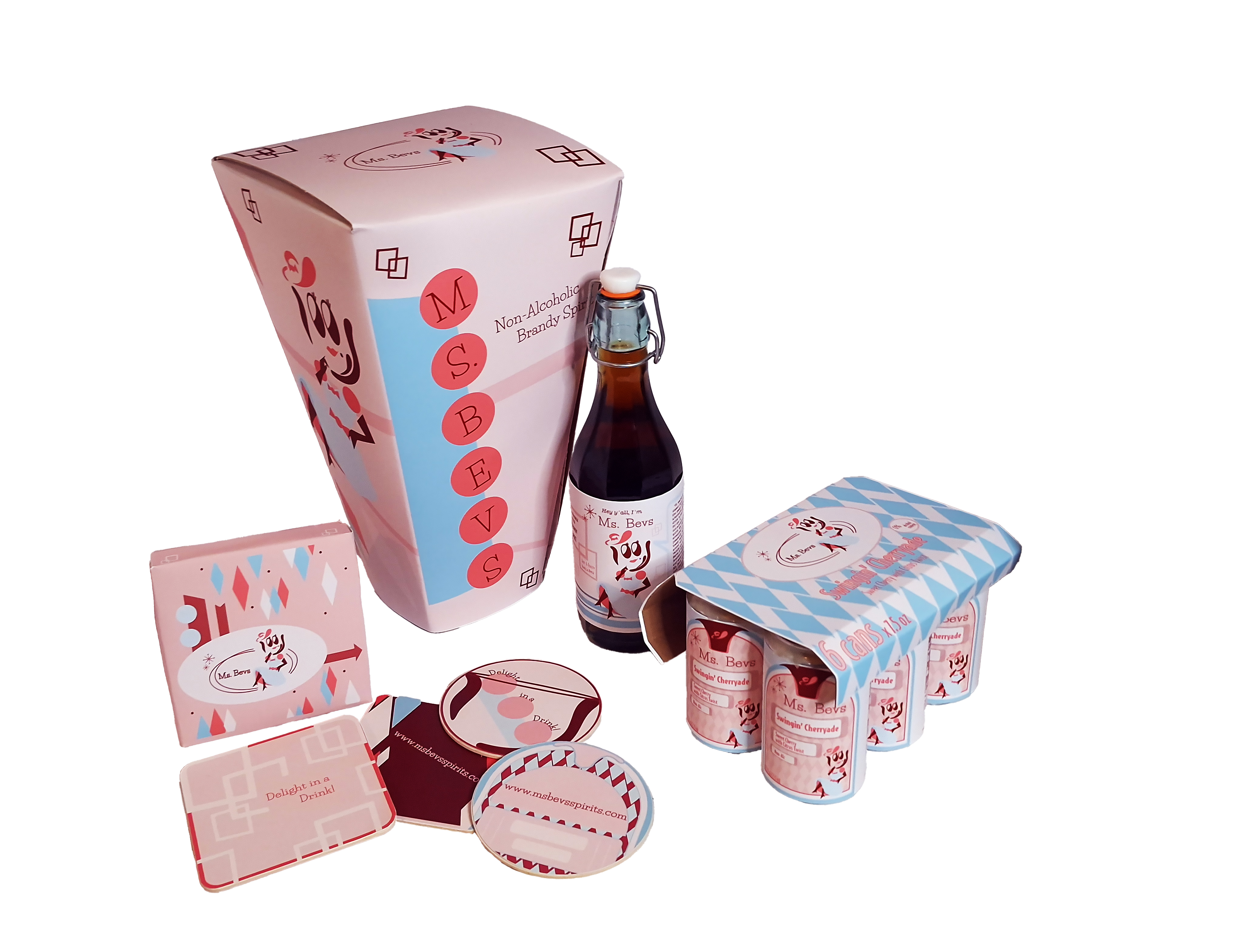
A packaging design for a mocktail (non-alcoholic) spirit brand. It’s heavily inspired by retro dining of 1950s America and the brand’s personality is focused on a vintage look and playfulness, encouraging for those who want the fun of drinking without the risks. The logo design is reminiscent of 1930s cartoons, and it also utilizes patterns, signage, and references of the mid-century modern era.
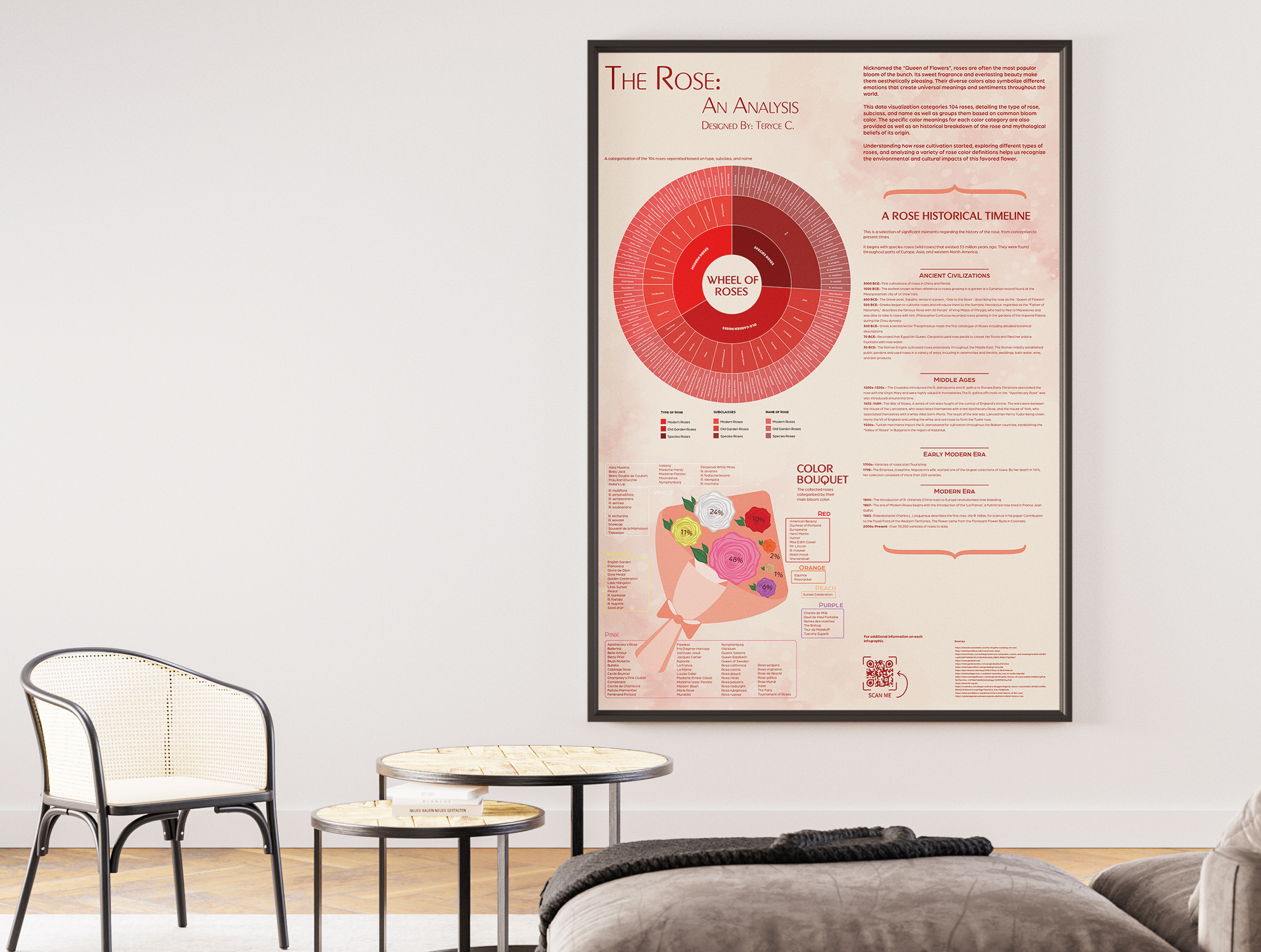
An infographic that explores in detail the significance of the “Queen of the Flowers,” the rose. It includes the categorization of 104 roses by type and bloom color, and historic moments surrounding the rose’s development, from origin to the number of species present today.