

Elizabeth is incredibly selfless and detail-oriented. Working with her has been a joy—she’s determined, caring, and committed to excellence. I couldn’t imagine a better person to have on the social media team.

Elizabeth has a strong sense of direction in everything she does in her graphic work. Her designs are bold, structured, and make a statement.

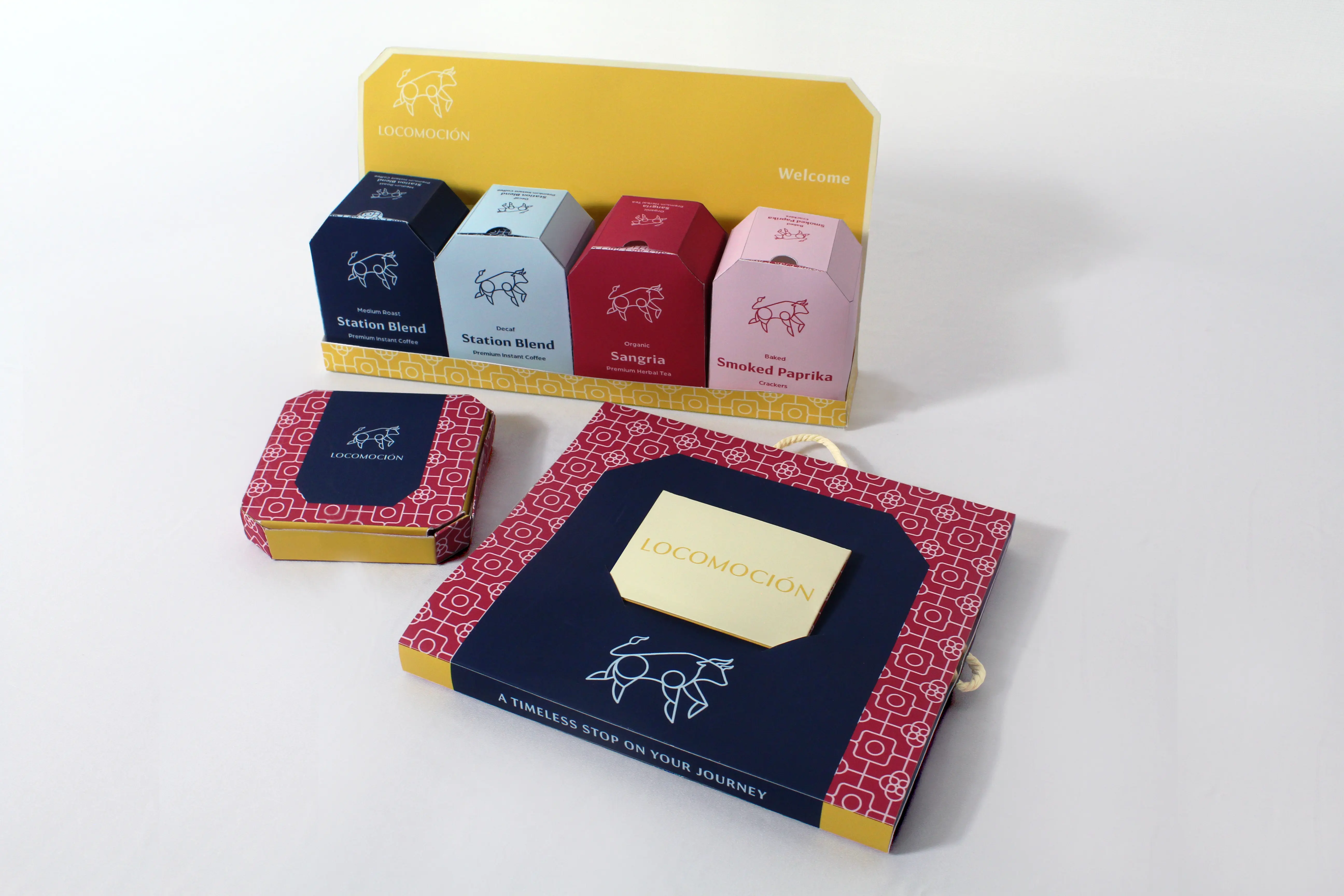
This boldly elegant and sustainable packaging system is designed for Locomoción, a boutique hotel in Madrid, Spain that was once a historic train station and has since been renovated into an upscale resort. Art Deco and traditional Spanish tile work influences are blended with the lively culture of modern Madrid to create a dynamic visual identity. Including a sewing, stationery, and welcome kit, this system is thoughtfully crafted for guests to take with them beyond the end of their stay.
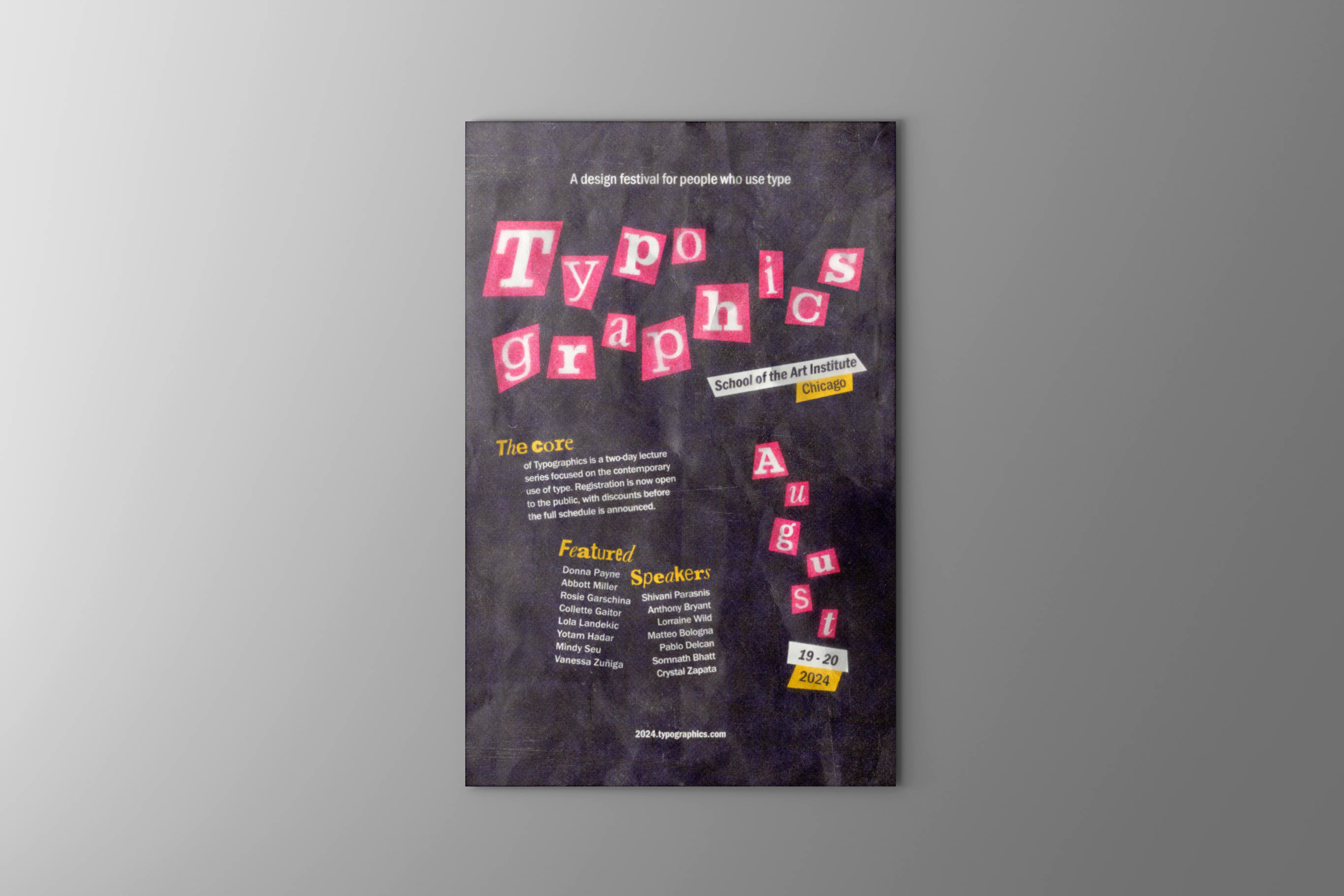
Drawing inspiration from Jamie Reid’s work and punk design, this poster balances chaos with organization. Ransom note style typography is grounded with sans serif type to present the event’s information in a bold yet clear manner. Vibrant colors and an asymmetric layout guide viewers through the composition while texture provides depth, creating a seemingly tactile feeling akin to a distressed collage.
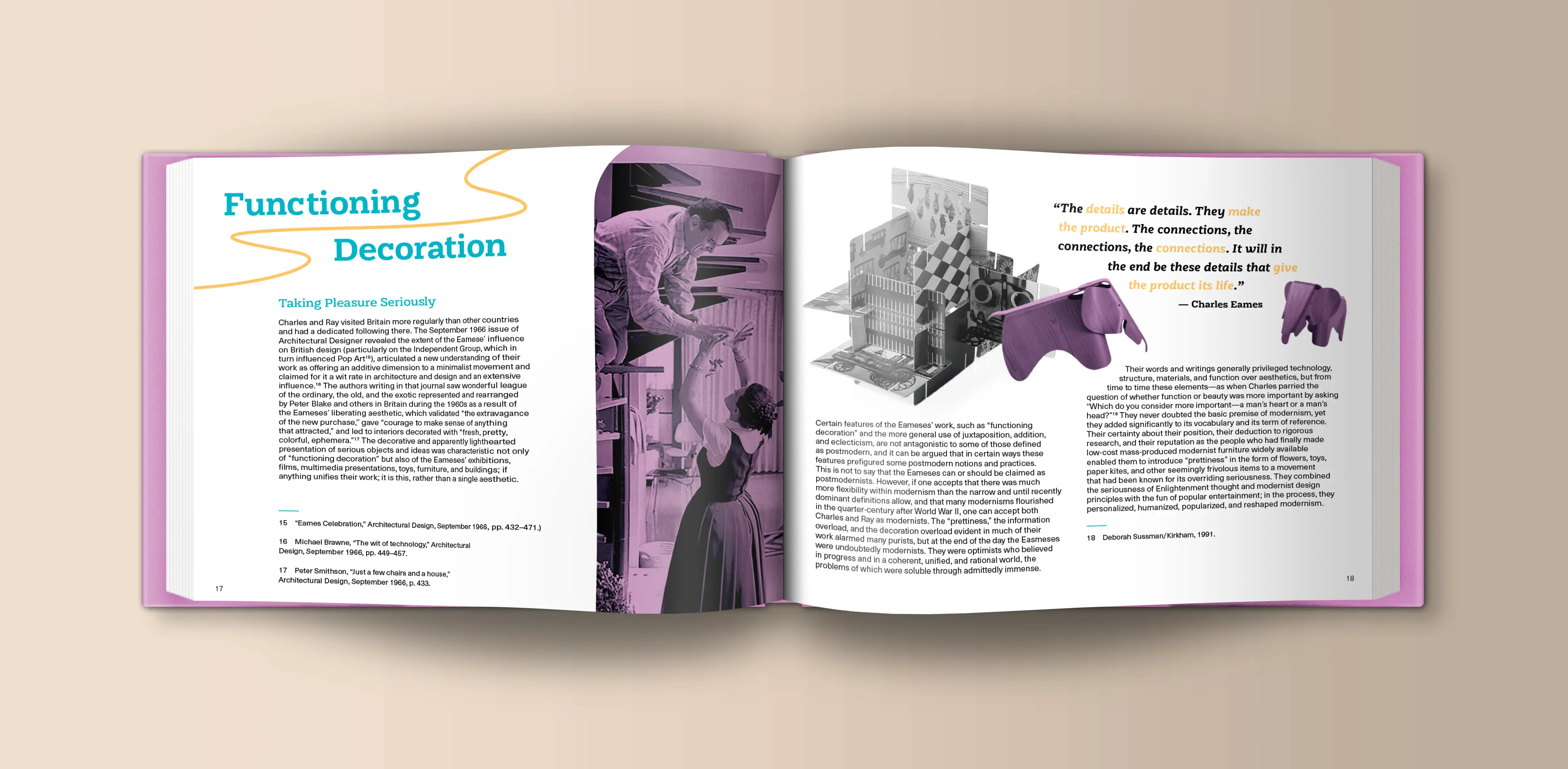
This coffee table book provides an intimate look into Charles and Ray Eames, celebrating their innovative design work across furniture, architecture, film, and more. A playful mid-century modern touch is present throughout with the typography along with an energetic color palette consisting of purple, teal, and yellow. Juxtaposing Ray's flowing artistic sense with Charles's more structured, architectural roots, each page is rich with information, showcasing a variety of Eames works and products as well as photographs, sketches, and personal quotes that truly highlight the duo's enduring legacy.